
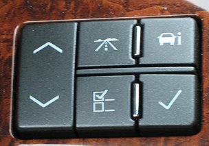
 There's a new bad design up at baddesigns.com. In this case, Mike criticizes the use of poor icons on buttons used to control something (I still can't figure it out) in a car.
Indeed, the icons are useless. But I think another criticism of the buttons could be made. Any buttons placed within reach of the driver should require minimal visual attention, as the driver should be paying maximum attention to the task of driving (a task that is of course, highly visual). So not only should the buttons not be marked with confusing icons, they also shouldn't all be shaped and/or textured the same way.
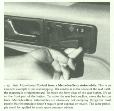
The shape/texture of the buttons needn't necessarily map to their function, as the seat adjustment control in a Mercedes-Benz (pictured to the right) does; simply making them easily distinguishable to the touch and laying them out in a reasonable (perhaps naturally-mapped) configuration would do the trick. It's easy to remember that the square button does this, the circular button, does that, etc. Far easier, then remembering that the top-middle button, which feels like all the other buttons, does something.
Sources of images: Button image from here. Seat-adjustment image from Norman, The Design of Everyday Things (2002)
No comments:
Post a Comment